CSS Notes
Table of Contents
Basic format of CSS:
selector {
property: value;
}
Resources
Reference & Guides:
- Learn CSS - Web.dev course
- FreeCodeCamp Responsive Web Design
- List of CSS selectors and properties
- W3Schools CSS Selector Reference
- Display and Positioning cheatsheet
- Navigation Bars
- A Practical Guide to Centering in CSS
- Centering a <div> in CSS
- Responsive Image Tutorial
- The :where() CSS pseudo-class function (for less repetitive CSS)
- Blog post on ways to name and use CSS classes: CSS Utility Classes and "Separation of Concerns"
Design Tools:
- Paletton colour picker
- Colormind colour palette generator
- Contrast Checker (web accessibility)
- Google Fonts
- Related read - Two ways to add custom fonts to your site: @font-face and @import
Technical Tools:
- Minify Your CSS
- CSS Browser Support - check whether a feature will work on different browsers
- Also see: Can I use? and Auto-Prefixer
Types of selector
.class (see section below)
#id (see section below)
* (selects all elements, but easily overridden due to lack of specificity)
element (e.g. h2)
element, element (e.g. h1, h2 - applies to 2 or more elements)
element element (e.g. h1 h2 - applies to the second element whenever it's nested within the first element)
element > element (applies to the second element whenever it's a child of the first element)
element + element (applies to the second element in cases where it immediately follows the first element - e.g. h1 + p will apply to the p)
element ~ element (similar to previous, except it selects ALL elements of the second type when following the first - e.g. h1 + p will apply to ALL p elements immediately after an h1)
:hover (e.g. h1:hover)
:last-child
:first-child
!important (overrides other CSS - not recommended)
Which selectors win out in the cascade depends on:
- Specificity
- Importance (see above note - not recommended)
- Source Order
- See also: Inheritance and CSS Inheritance, Cascade, and Specificity
Class vs ID
ID
The id selector is used for selecting a single HTML element with a unique id attribute value.
How to use within stylesheet:
#header { width: 100%; height: 80px; background: blue }
Applied to HTML:
<h1 id="header">Lorem ipsum.</h1>
Class
The class selector is used for selecting a single or a group of HTML elements with the same class attribute value.
How to use within stylesheet:
.content { margin: 20px 0; line-height: 24px; font-size: 15px }
Applied to HTML:
<div class="content">Lorem ipsum.</div>
Sizing text: px, em and rem
These are 3 different ways to size text.
- px means pixels - it's an absolute size (i.e. "anchored to some physical measurement").
- em and rem are relative methods of sizing.
- em is relative to the element that the selected text is contained within. Example:
<p>Hello World! <span>this is a section of text selected inline;</span> the text outside is not affected.</p>
Any text inside the <span> will be styled in the CSS settings for "span" and you can use the em value there, under the font-size property. The font size will be relative to the current CSS settings for <p>.
CSS stylesheet example (where font size is set to 1.5 times the original size):
span {
font-size: 1.5em;
}
Note: you can also make the font size relative to the viewport size using VW and VH.
Pseudo-classes and pseudo-elements
Pseudo-class is used to define a special state of an element.
For example, it can be used to:
- Style an element when a user mouses (hovers) over it
- Style visited and unvisited links differently
- Style an element when it gets focus (e.g. clicking on an input field in a form)
- Style the first-child, last-child, etc, of an element.
Format:
selector:pseudo-class {
property: value;
}
Example:
a:hover {
color: #FF00FF;
}
Pseudo-elements work in a similar way - however, they act as if you had added a whole new HTML element into the markup, rather than applying a class to existing elements.
Note: pseudo-elements use a double colon :: instead of a single one at their start.
Example:
article p::first-line {
font-size: 120%;
font-weight: bold;
}
The example above turns the first line of a <p> element (which is nested in an <article> element) into a selectable element of its own, and allows you to style it. The amount of text styled will vary depending on the size of the viewport - only the first line will be styled.
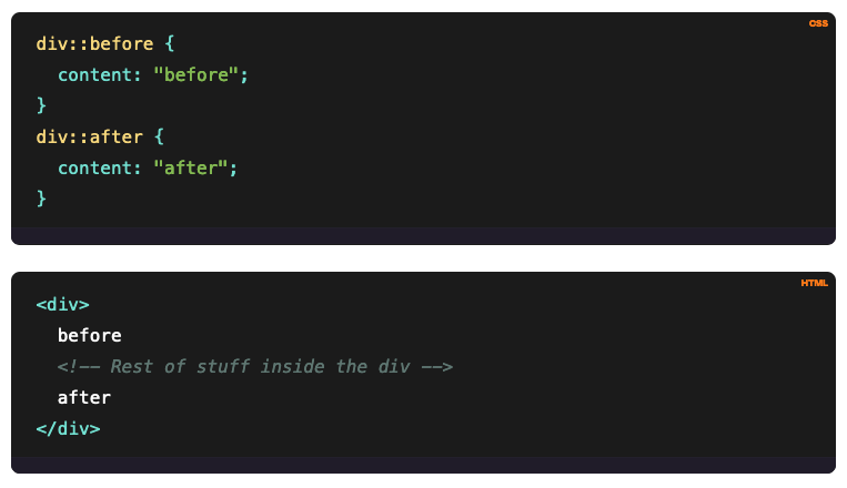
Handy example of how the ::before and ::after pseudo-elements work:
More info and a full list of pseudo-classes and pseudo-elements.
COLOUR!
You can use Hex, RGB, or HSL (hue, saturation, lightness).
Here's an argument for why HSL is the best option.
Also check out CSS gradients to do cool stuff like this:
Gradient Backgrounds
Animations in CSS
Make things move :)
- Mozilla guide to using CSS animations
- W3Schools guide to CSS animations
- Library of animations at Animate.style
- Best practices (aka how to avoid being a dick with your animations!)
- Hubspot "Ultimate guide" (with lots of examples)
- Transitions and Transforms for Beginners
- More examples here - from easy to complex
Grid and Flexbox
These are two CSS layout systems that can be used individually or together. Both have different strengths, so they can work well in tandem. You can combine them by using a Flexbox container inside a CSS Grid container. However, you can't use a CSS Grid Container inside a Flexbox container.
- A comparison of the two systems
- Reasons you might want to use Flexbox instead of/as well as Grid
- Guide to Grid Layout
- Grid Cheatsheet
- Using Grid template areas
- Grid auto-fill and auto-fit (for responsive sizing)
- A Complete Guide to Flexbox
- Flexbox Cheatsheet
Coding Games

Lots of CSS games at Codepip.com (inc. Flexbox Froggy! ♥)
...Plus a CSS quiz at W3Schools.com